Similar Posts

Latest from shadowstats.com
Click each image to view larger ones.
From Shadow Government Statistics ~ John Williams

Food & Health – Week of 11.06.16
Single Mom Faces Jail Time After Participating in Facebook Food Group
FOX 40 | 04 November 2016
“My kids”…

Martial Law via Swine Flu
By Chelsea Schilling
Pandemic bill allows health authorities to enter homes, detain without warrant.
…the following states have implemented legal actions in response to the H1N1 virus:
Florida …

Science & Technology – Week of 3.13.11
July 7, 1958: The 1,700-foot Tall Tsunami that Struck Alaska -The Largest in Recorded History
The Daily Galaxy (11 March 11)
Scientists Project Path of Radiation Plume
The New York Times (16 March 11…

Money & Markets – Week of 9.25.11
China Loan Shark Market Crashes; Scores of Chinese Business Owners Unable to Pay Black Market Loans Commit Suicide or Disappear
Mish’s Global Economic (29 Sep 11)
UK rejects EU Sponsored Financial Ta…

Ode To Big Bankers
A network member requests that we offer up a place to post limericks and songs to lift our spirits in a dire hour. Here is her contribution:
Ode to Big Bankers & Politicians
Enjoy yourself, you …
3 Comments
Comments are closed.


Speaking of the employment situation, Junior Achievement just put out a new report about how the country needs a more “Entrepreneurial Workforce” to remain competitive. It’s kind of a different way of looking at the problem. Here’s the link http://www.ja.org/files/The_Entrepreneurial_Workforce_full-11.pdf.
This is just amazing… Reminds me of what Community Wizard could be like, too. It really sums ups what’s happening to me in job loss… Wow!
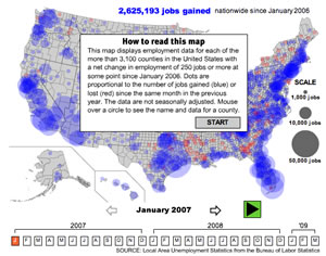
Excellent presentation of data. Unfortunately, it looks like someone dropped nukes on all of our cities.
Sorry I haven’t had the opportunity to chase this down myself, but does anyone know an easy way to find total jobs nationally, and in each county. I’d like to get an idea of percentage of job losses by county. In fact, that would be an interesting way to see this graphic presented – displaying percent job loss by county in addition to aggregate losses (would normalize the graphic for a more fair comparison across counties)