
Rambus Blockbuster Chartology

By Catherine Austin Fitts
My “go to” website for technical analysis of precious metals, the US dollar & the US stock market is Rambus Chartology, where Rambus (that’s his handle – he’s the founding technical analyst) leads a discussion with extensive charts of what the markets are saying.
In January 2016, Rambus launched his quarterly Solari Report with a Blockbuster Chartology. You can find links to the entire series of quarterly and annual Blockbuster Chartologies at the end of this latest piece.
One of the reasons that Rambus is so good at his craft is that he focuses on “staying on the right side of the major trend.” The challenge of doing so at this time is that it is tempting to look for bottoms or to assume that the trend upwards in the US dollar or stock market may be over. However, Rambus consistently brings us back to the discipline of the Chartology. What does price tell us? As he describes so aptly, we are dealing with psychological warfare.
Sitting back once each quarter to get this perspective offers invaluable insight. So, here we go for the 2024 Annual Wrap Up Blockbuster Chartology!
Blockbuster Chartology Quarterly Report
By Rambus
~ 2024 Annual Wrap Up ~
PM Complex
US Stock Markets
An In-depth Look At The Precious Metals Complex…
PM Complex
Last Thursday during the Markets Update I mentioned that the big up day in the PM complex was either a shakeout before the PM complex moved lower or it could be the beginning of something to the upside. Tonight I would like to show you a few new charts that could have bullish implications, but keep in mind we still need to see a bit more bullish price action before pulling the trigger and getting positioned back in the PM stocks.
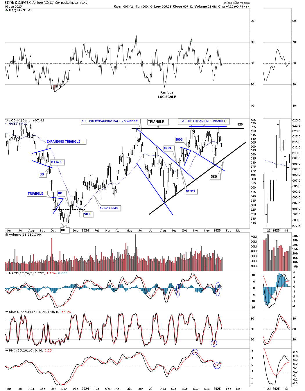
The CDNX which has been lagging the rest of the PM complex pretty significantly, may have finally given us a very big clue last week that the bears are close to being defeated. I know that is a pretty bold statement for this beaten down sector but I’ll try to paint a positive picture of what is taking place which is a big deal for the overall health of the PM complex.
Here is what I wrote in last Weekends, Weekend Report, in regards to the CDNX.
With that said lets look at some charts starting with this short term daily chart for the CDNX. After hitting resistance for the third time at the previous highs the price action sold off once again down to the bottom of the October trading range as shown by the black arrows. It would be a very healthy sign if the CDNX can hold support at the most recent low where it has gotten a small bounce so far which could be the all important fourth reversal point if the top of the October trading range can be taken out leaving behind a rectangle consolidation pattern. There is still more work to do, but the potential bullish setup is there.

Today January 5, 2025:
Below is the exact same chart as the one above but with Thursday and Friday’s price action. As you can see the bottom of the horizontal trading range held support except for that slight breach of the bottom trendline which we can now label as a false breakout / bear trap.
When looking at this daily chart for the CDNX it looks rather messy, but I can assure you behind all the clutter there is some really nice Chartology which I will bring to light. All the chart patterns starting with the first reversal point in the black expanding falling wedge are relevant to the big picture which we’ll look at in a minute.
The minimum price objective for an expanding falling wedge or falling wedge is to where the wedge began to form. In the case for the black expanding falling wedge and the smaller blue expanding falling wedge both met their minimum price objective. Many times though they can be a stand alone pattern which would be a halfway pattern, but not in this case.
Take one last good look at this chart, we’ve been following for a very long time, because this is the last time I will show it to you. With last weeks price action I now have the chart pattern that has been hidden behind all the clutter which will be part of a bigger consolidation pattern which is key to understanding the bullish picture for the micro cap PM stocks that reside in the CDNX.

Below is the exact same chart as the one above, which may still look a little cluttered, but we now have a very clear picture of the underlying chart pattern, the black May symmetrical triangle with the 4th reversal point being completed last Friday. You can still see the large blue expanding falling wedge which began the formation of the May black triangle with the small blue triangle which formed about at the halfway point in the first rally to the top trendline. I switched colors on the small blue expanding falling wedge on the chart above to red on this chart which was the first reversal point in the blue flat top expanding triangle which was created by that false breakout / bear trap. There are four separate chart patterns that make up the May triangle which we can now take to the next level.

The next level for the May 2024 triangle is the right shoulder for this two year inverse H&S bottom with the neckline now being tested. Note the beautiful symmetry with both the left and right shoulders being symmetrical triangles. Also notice how the neckline symmetry line is showing us the low for the left and right shoulders. I also left the two smaller blue consolidation patterns in the right shoulder triangle so you can see how they fit into the bigger picture.

Now we can show how the H&S bottom on the daily chart above fits into the longer term weekly chart which is creating the 4th reversal point in the much larger 2021 bullish expanding falling wedge. The 2021 bullish expanding falling wedge actually began to form six months after the rest of the PM complex began forming their bullish expanding falling wedge in September of 2020. This is probably why the CDNX has been lagging. Better late than never.

Taking it to another level, below is the monthly history chart which shows all the consolidation patterns the CDNX has created since its inception. Note where the current H&S bottom is located which is above the capitulation low and below the 2021 five point bearish falling wedge reversal pattern. Since the blue falling wedge reversal pattern led to a decline we needed to see some type of reversal pattern to reverse the downtrend and the H&S bottom fits the bill perfectly. Now we just need to see the breakout take place to get the ball rolling to the upside.

This last chart for the CDNX is the quarterly line history chart which shows just the large trading ranges.

I also may have uncovered a possible short term bullish pattern for the PM stock indexes which we’ll look at in a minute.
First, is the March 2024 bearish rising wedges with the smaller blue bearish rising wedges we’ve been following as possible halfway patterns. Earlier last week I was looking at the small price action just below the blue rising wedge as a possible consolidation pattern to the downside until last Thursdays big move up. Once the price action traded above the previous minor high I added the black dashed horizontal line which could show a potential double bottom which is still too early to know yet, but with the gap up on Thursday it’s possible, see March 2024 double bottom breakout gap.

This short term daily chart shows the downtrend channel since the October high where the current correction began. When I took those two small positions in DUST and JDST my goal was to exit those positions if the price objective was reached which still could be the case, but as I just mentioned above there is another possible scenario unfolding which we should know the answer to in just a few days.
Below is a new daily combo chart for the PM complex which shows a new March 2024 uptrend channel in log scale. Last Thursday when the PM complex had that big day up with a gap opening, it may have created a small double bottom reversal pattern. Lets put it in context.
In March of last year I was able to spot that small double bottom reversal pattern which led to the rally high in October. Note the decline coming down into that March 2024 low with the small blue consolidation pattern that formed on the way down. The horizontal black dashed line shows the double bottom trendline which formed just below the bottom of the small blue consolidation patterns, black arrows.
If we look at the current decline from the October high we can see another small blue consolidation pattern with the same setup as the March 2024 setup, horizontal black dashed line with the black arrows forming just below the blue consolidation pattern. The blue circles show the possible double bottom reversal patterns with a breakout gap in most cases. If last Mondays low can hold then we’ll have a pretty decent parallel uptrend channel beginning at the March 2024 double bottom low and last weeks low.
We should know something this week and if the double bottom trendline can hold the backtest that will be my cue to start getting long the PM stocks which is what we did in 2024 with that double bottom setup on March 5th.

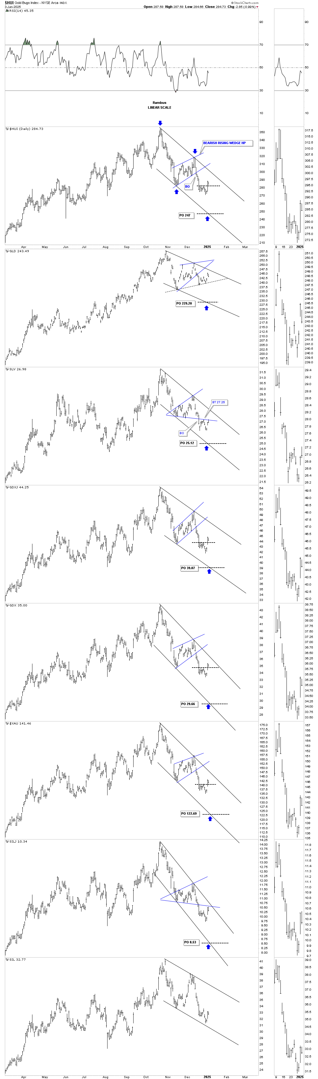
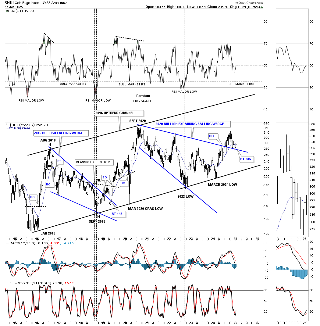
This next chart for the HUI shows its 2016 uptrend channel with the breakout and backtest taking place to the 2020 blue expanding falling wedge. The backtest has been a little strong, but is still holding and the HUI did close back above the top rail last Friday.

This next chart shows the 2016 uptrend channels from the monthly line chart perspective. If you recall I added that blue circle to the breakout point on the blue 2020 downtrend line so we could refer back to it to see if it was a valid breakout. All of the breakouts are still valid with the XAU being the only one that is still backtesting its 2020 trendline.

And then we have this weekly chart to deal with yet which is showing those potential unbalanced H&S tops still in play. The very first thing we’ll need to see is for the price action to negate those necklines and then the right shoulder high, to be totally out of the woods.

Below is the history chart for the HUI showing the backtest to the top rail of the 2020 expanding falling wedge still in progress. The breakout from the 2020 expanding falling wedge still looks very similar to the breakout and backtest to the top rail of the 2016 bullish falling wedge in both time and price.
We still have a whole quarter of price action to go before we see how the current backtest to the 2016 bullish expanding falling wedge, on this quarterly line chart plays out. The fourth quarter of last year closed right on the top rail with the rally last week showing a small bounce, but a bounce.

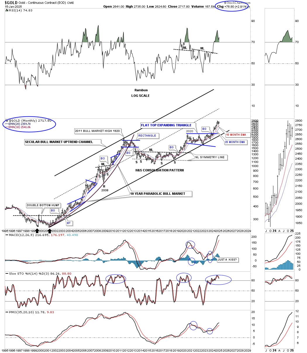
Moving on to Gold we can still see an unfinished trading range building out at the top of the rising channel. If a consolidation pattern is building out then the all important 4th reversal point will either be on the bottom rail of the black triangle, which is now being tested, or the bottom rail of the 2023 uptrend channel which would show a bull flag with a parallel upper and lower trendline.

A slightly different perspective.

Gold’s monthly chart using the 10 and 20 month ema for long term support. When Gold is in a strong bull market rally phase, see 2008 to 2011 rally and the 2018 to 2020 rally, the Slow stoch can stay embedded for long periods of time which may be happening right now if we get that triangle consolidation pattern forming on the daily chart above.

This quarterly line chart shows the bull market years from the 2000 low to the 2011 high and how smooth the price action was except for the 2008 crash. You can also see how smooth the price action was from the 2018 low to the 2020 high. The current rally phase out of the 2020 expanding triangle has been pretty smooth with the exception of last quarters price action which traded sideways. Unless we see a larger correction the first quarter for 2025 should end either up or sideways.

This last chart for Gold is the long term quarterly bar chart showing the angle of the 2000 to 2011 bull market years vs the current rally phase using the 2011 bullish rising wedge as a halfway pattern. The price action was getting a little strong, but this quarter its back in line with the angle of the 2000 to 2011 bull market angle, long black arrows.

Sometimes the breaking out and backtesting process of a chart pattern can be very swift with no backtest at all. And then you can see one like Silver is currently experiencing which has been in breakout and backtest mode since September with nothing broken just a lot of frustrated investors.
As you can see Silver is currently forming a small double bottom above the top trendline to finally complete the backtesting process or in a worse case scenario a rectangle consolidation pattern to the downside if the top trendline doesn’t hold support.

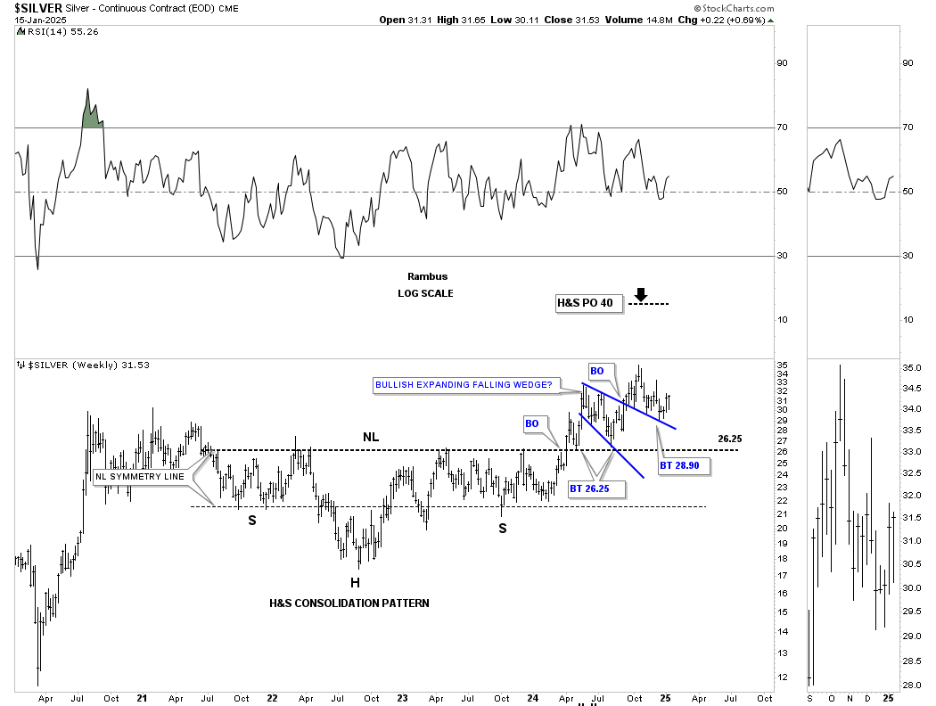
We’ve been following this daily chart of Silver for several years and its hard to give up on that very symmetrical H&S consolidation pattern. There is no doubt that the backtest has been very laborious and frustrating, but nothing is broken plus we still have a minimum price objective up to the 40 area that still needs to be achieved.

The H&S consolidation pattern on the daily chart above is just the right shoulder of this massive 2011 H&S consolidation pattern. Note how each important trendline has been backtested starting with the multi year double bottom trendline which formed both heads of the H&S consolidation pattern. Then the smaller right shoulder neckline at 25.50, the larger right shoulder neckline at 26.50 and the top rail of the blue expanding falling wedge at 28.90.

This last chart for the PM complex is the long term monthly chart showing the 2011 triangle consolidation patterns with most being in breakout and backtest mode. A few backtests are becoming a little sloppy but no major problem yet especially on this long term timeframe.

Next is the daily chart for the US dollar which could still be a problem, but wasn’t a problem last Thursday when it broke out from the blue triangle and reached the minimum price objective for the H&S bottom I labeled in blue.

And this weekly chart for the US dollar which shows not much in its way up to the 2022 high.

A quick look at the US stock market using this 60 minute chart shows several potential H&S tops forming, but no violation of the necklines yet. If we do confirm some H&S tops that could lead to a correction of some degree, but at this point just a correction in the ongoing 2009 bull market.
This last chart for tonight is the 2 hour chart for BTCUSD we’ve been following showing a rectangle forming below the 5 point rising flag reversal pattern. With the completion of the 5th reversal point the bulls have a chance to take BTCUSD higher if they are in charge as the blue rectangle will be a reversal pattern to the upside. So the balls in their court.
This week is going to be critical for the PM complex with a lot hanging on that possible very small double bottom reversal pattern on the daily combo chart. If it can hold then I plan to start getting positioned once again in the PM stocks. All the best…Rambus

US Stock Markets
It’s been awhile since we last really looked at the US stock markets in any detail. Tonight I would like to focus mostly on the SPX from the short to longer term charts to see what may be brewing below the surface.
At this point in time I still believe we are in the early stages of a correction that could persist for a period of time, but eventually the US stock markets will make new all time highs again. I’m also keeping an open mind to something much deeper like the 2022 correction which was about 25%. Ultimately though I will follow what the charts are suggesting and try to keep an unbiased opinion.
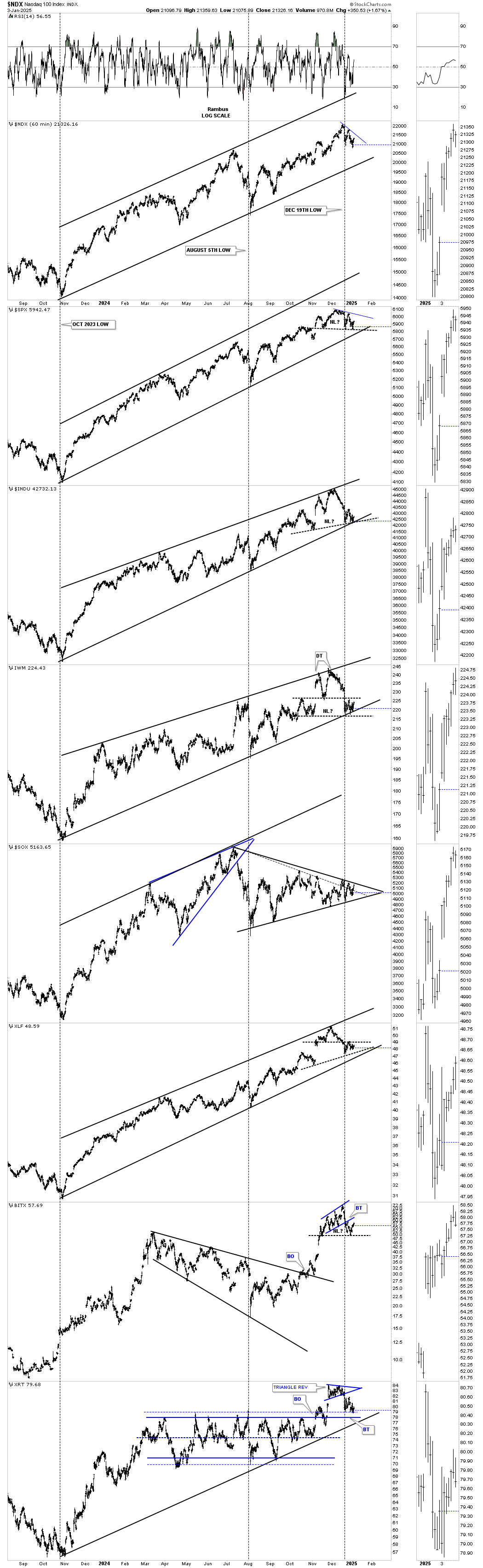
I’m going to start with this 60 minute combo chart we’ve been following showing the rising wedges and H&S tops that have been forming since August 5th low to the middle of December for the most part. Last Friday’s price action produced a couple of breakouts below the necklines on the INDU and IWM with the SPX closing just above its neckline.The XLF closed below the bottom rail of its blue triangle consolidation pattern. This is causing a new slightly lower low to form which is the first sign of a new downtrend.

Next is a daily combo chart showing the blue rising wedges with a couple of uptrend channels. The IWM looks particularly vulnerable as its showing a H&S top which is forming at the 7th reversal point in the January 2024 expanding rising wedge which if the bottom rail gives way would be a 7 point bearish expanding rising wedge.
The NDX at the very top shows the blue morphing rising wedge with a false breakout above the top and bottom trendline.
After being the strongest area in the stock markets, until mid summer of last year, the SOX is now one of the weakest sectors as it’s far below its summer highs while everything else on this chart topped out in December. This could be a warning sign for the rest of the stock markets.

Next is the 2 hour chart for the SPX showing the classic H&S top with the left shoulder and head forming inside of the rising wedge with the right shoulder high being the backtest to the bottom trendline. The possible H&S top in now unbalanced with two right shoulders. The brown shaded S&R zone shows where previous support and resistance played out with the H&S price objective just below which could be initial areas of support.

This daily combo chart focuses on the H&S tops with some unbalanced and a few showing a strongly slanted H&S top. You can also see the right shoulder on most of the indexes are the blue consolidation patterns with many breaking out below the bottom trendline last Friday. The IYR actually broke out last Wednesday with a backtest on Thursday and follow through to the downside on Friday.

This next chart is a weekly look at the SPX in linear scale which begins at the 2020 pandemic crash low. First, note the two buy signals where the 30 week ema crossed above the 50 week sma, green circles and the one sell signal where there was a negative cross as shown by the red circle. Currently they are in a nice parallel alignment.
Next note how the H&S top, we’ve been following on the short term combo charts, is sitting at the current high which looks a bit precarious at the moment especially if the neckline gives way.
The other interesting feature on this weekly chart is the length of the 2020 to the 2021 rally high before the 25% correction took place compared to the low of the 2022 H&S consolidation pattern to the present high, as shown by the black arrows which are almost exactly the same distance. Price wise both impulse moves were the same length, but time wise the 2022 to 2024 rally took more time to complete which could mean the SPX may be getting exhausted especially with that possible H&S top, sitting at the high of the present rally, completes to the downside.

This next combo chart is a monthly look showing how the 12 month sma does a pretty good job of holding support during a strong impulse move higher. Currently the two weakest areas we identified on the daily combo chart above, the IWM and SOX, are the closest to testing their respective 12 month sma. The BTCUSD looks particularly vulnerable as it’s showing a monthly reversal bar and because the rally was so strong out of the previous consolidation pattern, there isn’t much to slow down the price action.

This weekly chart for the SPX is one we were following during the 2020 to 2021 rally phase which ended with the bearish rising wedge. Could history be repeating once again? The first clue will be if we see the 30 week ema give way which would confirm the current rising wedge could indeed be a bearish rising wedge.
The SPX didn’t find support during the 2022 correction until the price action found the 200 week sma and if history is going to repeat could it happen once again?

When looking at the long term price action on a linear scale chart vs a log scale chart you get a totally different look. From the 2009 housing and banking crash low to the 2020 high you can see the angle of the secular bull market was pretty normal. Once the pandemic low was made in March of 2020 the character of the secular bull market changed dramatically as shown by the angle of the impulse move to the 2021 high. Even though the 2nd impulse move, which started at the head of the 2022 H&S consolidation pattern wasn’t quite as steep is the 2020 – 2021 impulse move, it still was very steep and not sustainable which is why a correction is needed.
The other possibility we’ve been discussing is the potential melt up phase which would throw everything out of the window with the market marching to the beat of its own drummer where nothing would make any sense.

This monthly chart for the SPX shows one of the possible melt up scenarios where we would get a doubling of another channel to the upside as shown by the thin black rectangles.
Just for old times sake, note the 2000 to 2013 flat top expanding triangle consolidation pattern. That is the exact same pattern that Gold formed during its 2020 correction which is smaller but just as effective.

This next chart for the SPX looks at a few trendlines originating from important lows and highs. The top trendline connects the 2000 bubble high to the 2022 high that the SPX broke above at its most recent high. The lower upper trendline connects the 2007 high that was made just before the housing and banking crises and runs up to the 2022 high which halted the most recent rally where the possible H&S top is forming. You can see a little ping pong move currently taking place between the two trendlines at the top of the chart.

It’s been awhile since we last looked at this 100 year chart for the SPX which shows a pretty symmetrical parallel uptrend channel. The last time we looked at this chart the price action was getting close to the top trendline and now it looks like it has touched the top trendline, again where that small H&S top on the daily combo chart resides. What are the odds that we could see something similar to the 1929 crash where the price action transversed from the top trendline to the bottom trendline? Pure speculation at this time.

What will get my attention that the bears are really back in charge is if we see the SPX close below its 21 month sma on a monthly closing basis. The last long term buy signal we got was back in May of 2023 with a backtest in October of 2023 which led to the current rally. You can think of that 21 month sma as a moving trendline unlike a stationary trendline.

The 21 month sma is a mechanical system to use for long term buy and sell signals and even short signals. This is how the 21 month sma would have gotten you out of the stock markets at the 2000 bubble top.
From 1995 it would have kept you long the stock markets until the SPX closed the first month below the red 21 month sma, see BO. At that point you could have either stayed out of the stock markets or went short on the backtest from below. You would have then stayed short until the SPX closed back above the 21 month sma after the 2002 bear market completed and just stayed long until the next bearish cross.

This next monthly chart shows how the 21 month sma would have gotten you out at the 2007 housing and banking high just before the crash into the 2009 low.
As you can see you would have gotten long in 2003 after the bear market low and stayed long until the SPX closed below the 21 month sma. You could have either stayed out of the markets altogether or have gone short on the backtest from below. It’s not going to get you out at the very top or in at the very bottom, but it will protect you from a catastrophic bear market.

Since we are looking at the SPX tonight, below is the 75 year quarterly chart showing its secular bull markets with the 2009 secular bull market still intact.

What could cause the stock markets to correct or even start a new bear market? Below is a daily chart for the TNX which shows a very symmetrical H&S consolidation pattern which has a price objective up to the 55 area at a minimum which no one believes can happen right now.

That H&S bottom on the daily chart above is part of the 2023 bullish falling wedge we’ve been following which shows the previous high around 50 or so could show some initial resistance. As you can see the SPX is now breaking below the bottom rail of its October 2023 rising wedge with that small H&S top sitting at the apex.

This long term monthly combo chart has the TYX 30 year yield on top with the TNX 10 year yield on the bottom. Note the small blue falling wedge on both of the charts which is the same falling wedge on the weekly chart above. I realize how impossible it sounds for interest rates to have a sustained rise, which no one is expecting currently, but this combo chart is suggesting it’s a strong possibility.
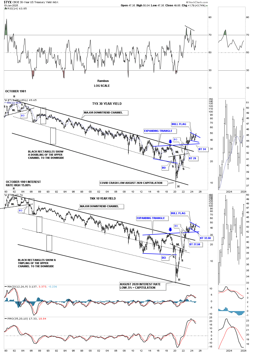
Lets finish up with the yield curve. This first chart is the spread between the 2 and 10 year bond which went negative back in mid 2022 and remained negative until July of last year. After finally breaking back above the zero line, un-inverted, the yield curve formed the bull flag as the backtest from above and is now moving higher.

This last chart for tonight is the combo chart we’ve been following off and on since the inversion which has the yield curve on top with the SPX on the bottom. The brown shaded areas show when the yield curve became inverted and when it became un-invertred. As you can see there can be a lag when the un-inversion takes place like the 2007 period, but eventually the SPX fell hard, black arrows.
Currently the un-inversion started before the SPX began to fall, but now you can see the SPX is showing some weakness for the first time in a while. Is this the beginning of a serious correction or something bigger? I’ll let the charts be my guide. All the best…Rambus

An In-depth Look At The Precious Metals Complex…
With the exception of Gold the precious metals complex has been a tough place to trade since the last important high made in 2020. Since that 2020 high the PM complex has been building a very bullish expanding falling wedge consolidation pattern which has completed its work of killing off any remaining positive sentiment that once existed which is a good thing.
In a secular bull market big consolidation patterns take time to develop, but are a necessary evil to keep the health of the bull market alive. With the completion of the 2020 bullish expanding falling wedge, in most of the PM stock indexes, the next big impulse move to the upside now has plenty of energy in reserve to last longer and go higher than what many think is possible.
We’ll start with the shorter term daily charts and work our way out to the quarterly charts so you can see how all the pieces of the puzzle fit together to paint a very bullish setup in the PM complex right now.
Lets start with the most beaten down sector, the CDNX, Canadian Venture Index, which is where many of the micro and small cap PM stocks reside. Since May of last year the CDNX has been working on an ascending triangle consolidation pattern which is getting close to completing. Last week we watched the price action hit the top trendline where I was expecting to see an initial short term decline which happens many times at previous highs.
As you can see the black triangle is made up of three smaller individual chart patterns, the bullish expanding falling wedge, the small blue triangle that formed close to the halfway point in the last rally to the top trendline and the most recent flat top expanding triangle.
To put the triangle above in perspective below is a longer term daily chart which shows a very symmetrical H&S bottom with the ascending triangle being the right shoulder. Note the beautiful symmetry of this 2 1/2 year H&S bottom as shown by the neckline symmetry line which shows the low for the left and right shoulders. Also both triangles are very close to the same size adding more symmetry to the H&S bottom.
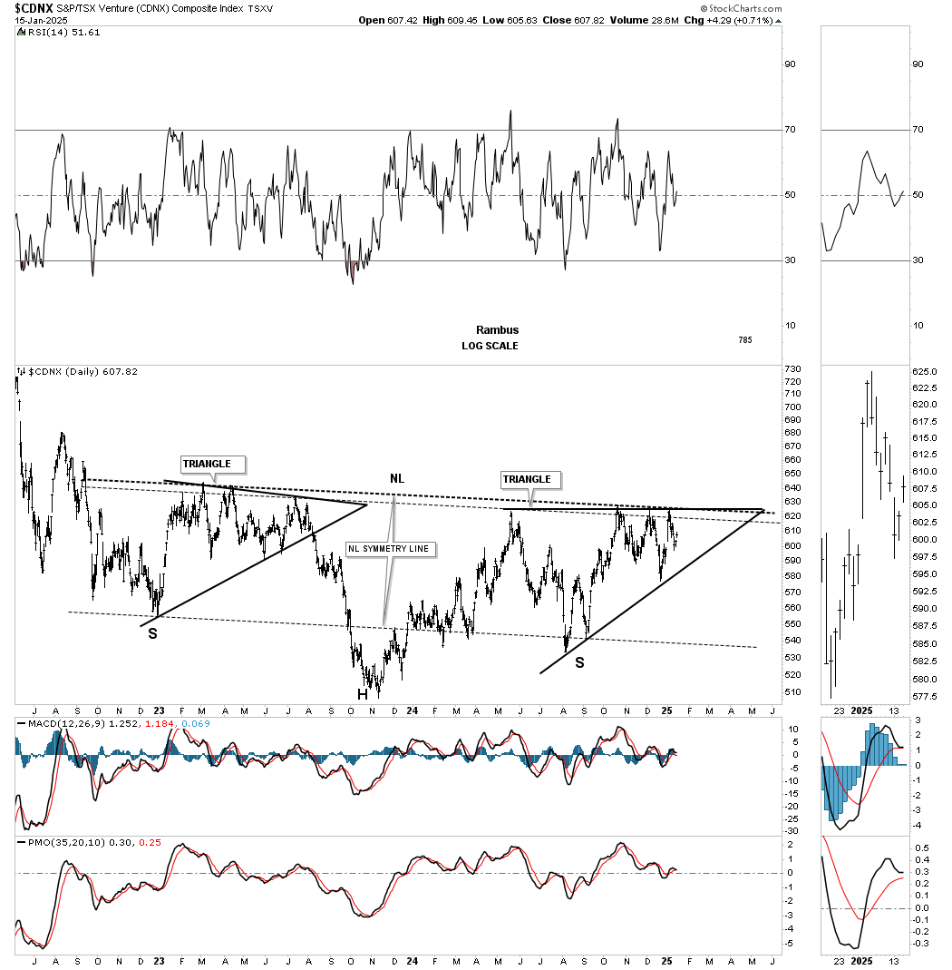
This next chart is a weekly look which shows how the H&S bottom fits into the much bigger picture which goes back to the spring of 2020 where the CDNX showed what it can do when the conditions are right.
Most of the PM stock indexes began to consolidate their previous rally phase in 2020 but the CDNX topped out 6 months later which is one reason its been lagging.

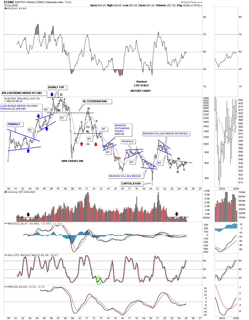
This last chart for the CDNX is its history chart and shows all the chart patterns it has formed since its inception. Note the capitulation move down to its bear market low in early 2020 and the V shaped rally to its 2021 high.
During the early days of the CDNX note how light the volume was until the bull market got underway in 2002 with the breakout of the blue triangle. Now note the current volume pattern on the right side of the chart, which has been drying up since the 2021 high decline and the formation of the very symmetrical H&S bottom. I expect to see the volume rise dramatically once the breakout above the neckline takes place and the impulse move begins.
Moving on to the HUI, which I’m going to use as a proxy for the other PM stock indexes, you can see the rally that began at the February / March double bottom low in 2024. That small double bottom doesn’t look that impressive, but it allowed us to start accumulating our first round of PM stocks.
Note how similar the January 2025 double bottom low looks compared to the March 2024 double bottom low. During the 2024 decline you can see the small blue consolidation pattern that formed about halfway down which was a clue that a possible bottom wasn’t too far below.
The correction that began at the October 2024 high into the January 2025 double bottom low looks very similar to the 2024 decline which again gave us the green light to start the second round of buys for our favorite PM stocks which so far has been working out quite well with a few more positions to yet acquire. The Silver area has been lagging a bit, but with Silver’s nice move up today that could be changing.
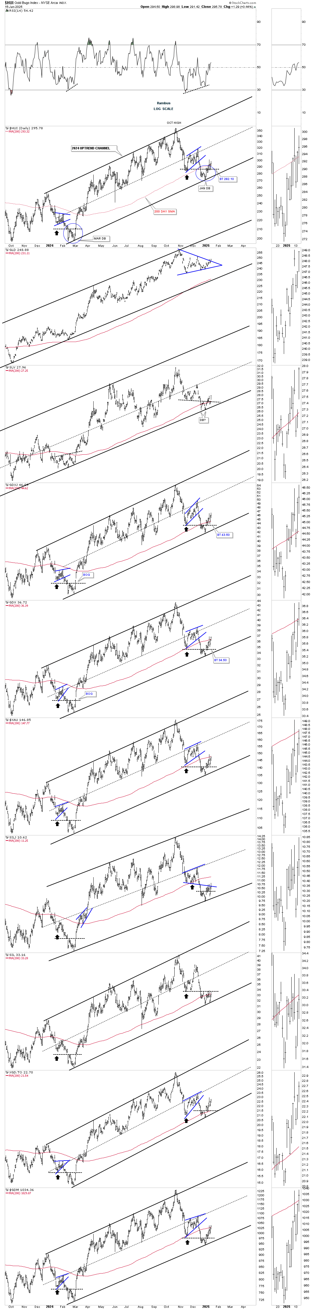
This daily line chart below shows the correction that began at the October 2024 high to the January 2025 double bottom low which has formed a bullish falling wedge consolidation pattern. One by one the top rail of the bullish falling wedges are giving way completing the consolidation pattern giving confirmation that the next impulse move to the upside is underway. Today the GDX, SLV and GDM joined GLD and XGD.TO in their breakout move. Note how much more pronounced the January double bottom low looks in this line chart vs the bar chart above.
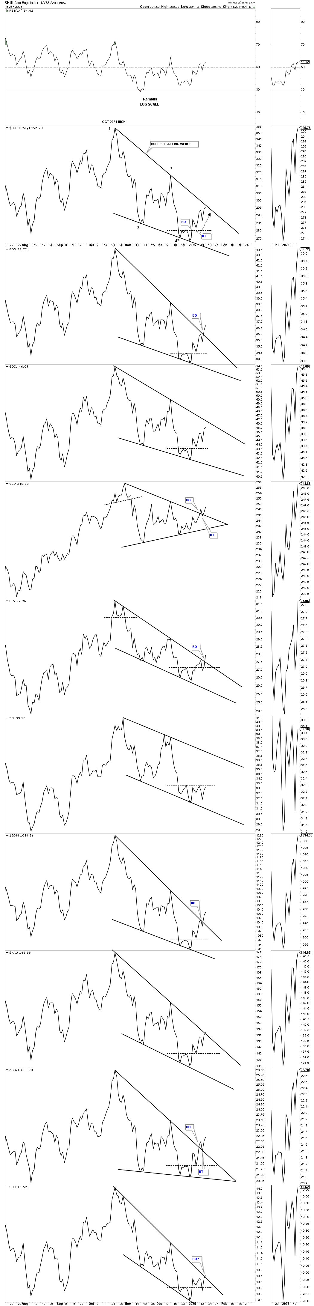
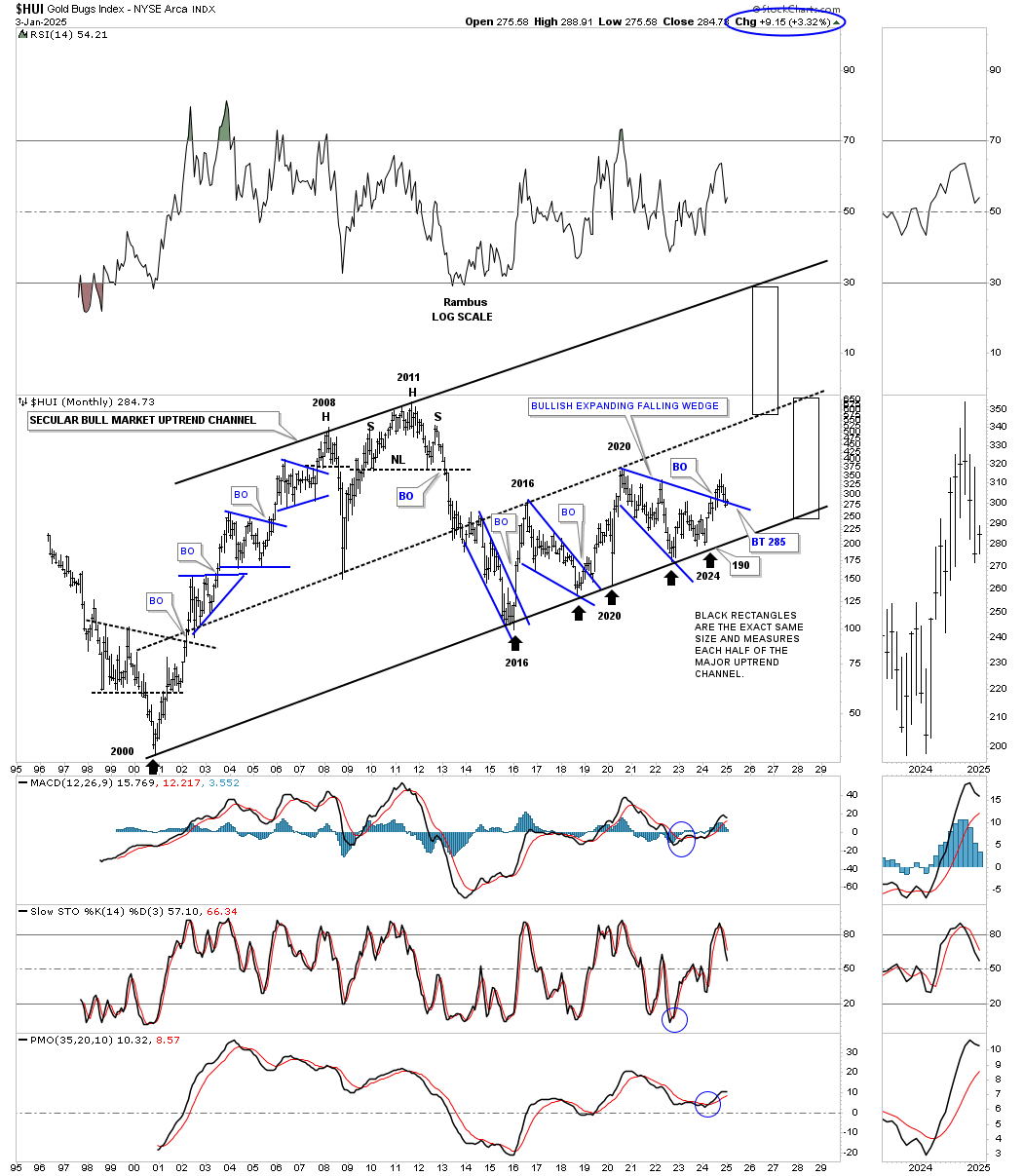
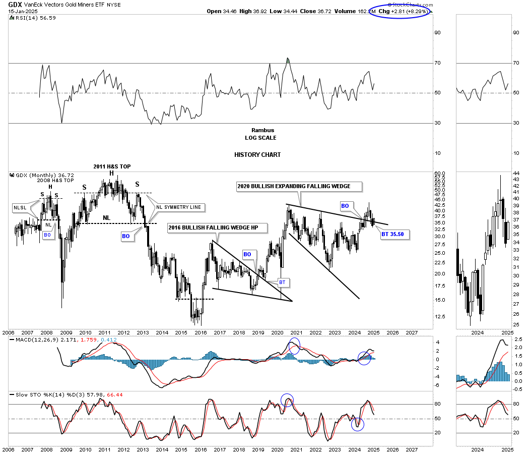
Since the bear market low in 2016 the HUI has formed just two large consolidation patterns, the 2016 bullish falling wedge and the current 2020 bullish expanding falling wedge. These two large consolidation patterns are responsible for the 2016 uptrend channel.
Keep in mind big consolidation patterns lead to big impulse moves. Note how similar the breakout and backtest was to the 2016 bullish falling wedge and the rally that followed to the current breakout and backtest to the top rail of the 2020 bullish expanding falling wedge which is just completing its backtest. There should be plenty of built up energy to launch this next leg up to the top rail of the 2016 uptrend channel.
Next is the history chart for the HUI which shows all of its big trading ranges since its inception in the mid 1990’s. From the 2000 low to the 2008 high the HUI formed a classic bull market with one blue consolidation pattern forming on top of the previous one. Note how the 2008 crash low found support on the center dashed midline of its 2000 secular bull market uptrend channel.
The thin black rectangles, on the right side of the chart, measure price and not time and shows the beautiful 2000 parallel bull market uptrend channel. The weekly chart above is the bottom half of the lower channel beginning at the 2016 bear market low. With the backtest now completing the next rally phase should be underway to at least the center dashed midline before another consolidation pattern of importance begins to build out.
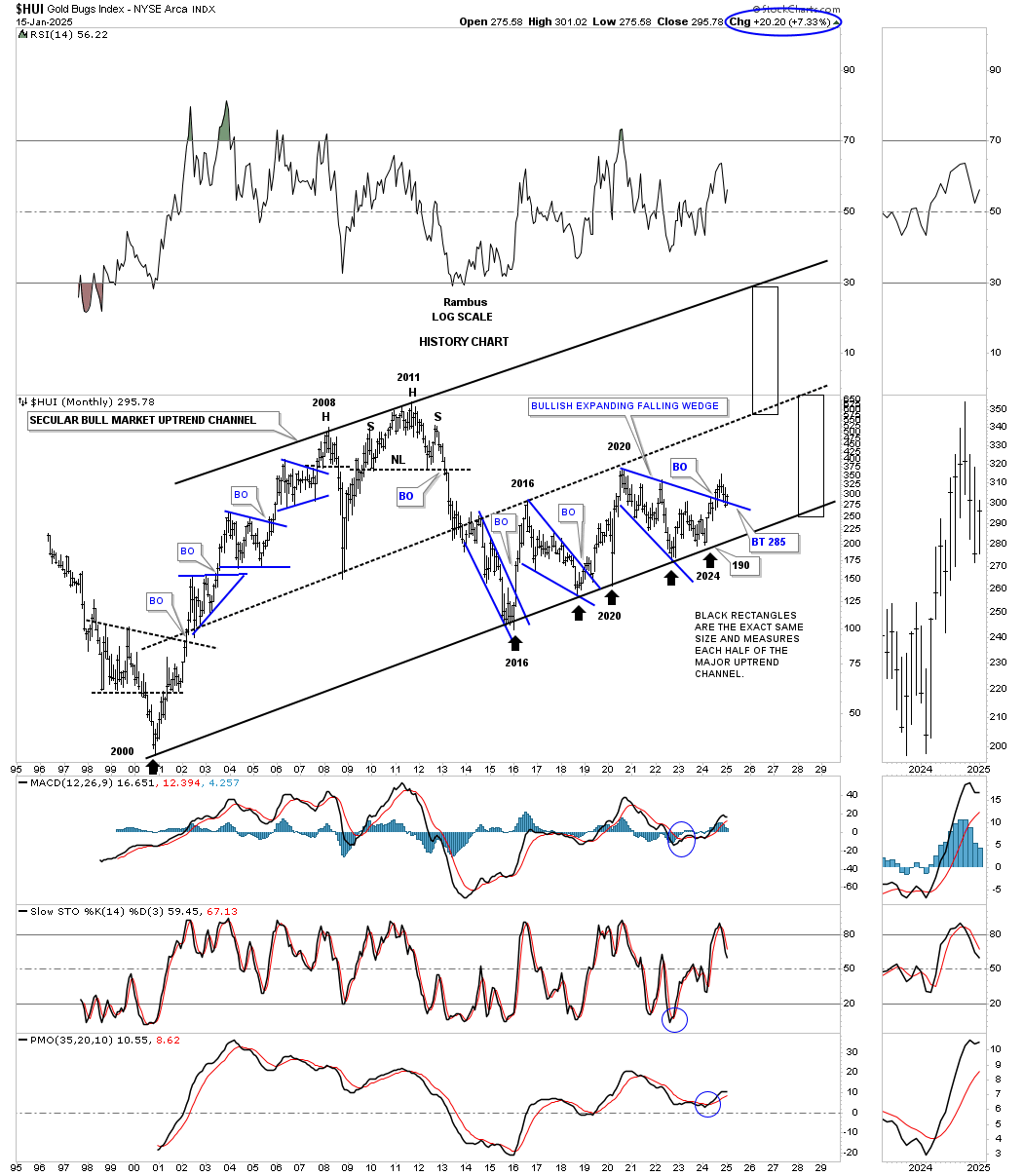
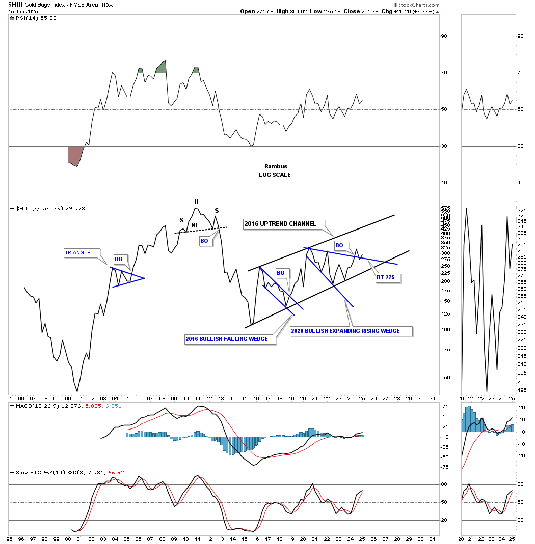
One thing I like about a quarterly line chart is that there is very little noise. If you see a chart pattern on a quarterly line chart then you know it will most likely play out. There is still a lot of time left for the first quarter of 2025 but you can see the breakout and backtest taking place to the 2020 bullish expanding falling wedge.
The GDX hasn’t been around near as long as the HUI, but you can see the chart patterns are very similar. The breakout and backtest to the top rail of the 2020 bullish expanding falling wedge has been a little more laborious than the HUI, but also appears to be completing.
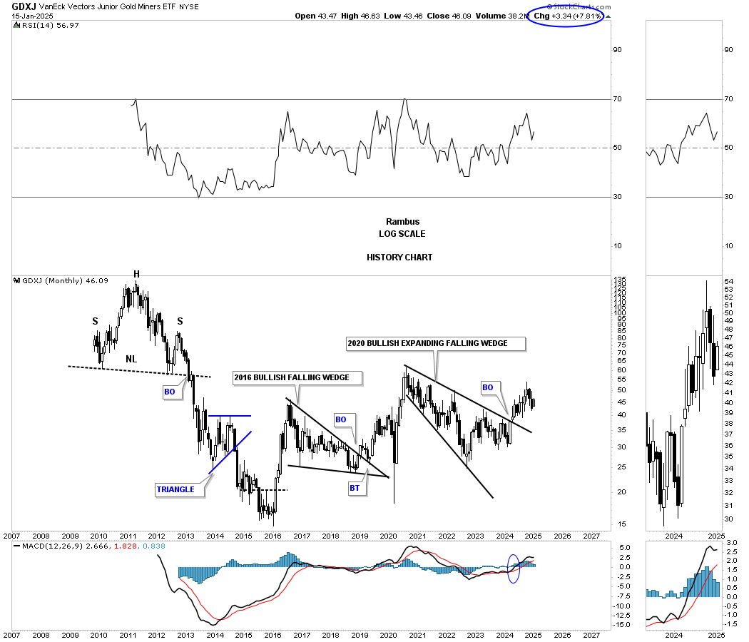
Here again you can see the similar chart patterns on this history chart for the GDXJ which shows its breakout a little more pronounced with no backtest to the top rail of its 2020 bullish expanding falling wedge.
There is no question that Gold has been leading the PM complex higher in no uncertain terms. Since the October 2023 low Gold has formed a very nice parallel uptrend channel with three evenly spaced consolidation patterns. After hitting the top rail of its recent triangle consolidation pattern last week, with a small selloff, Gold is now testing the top rail once again.
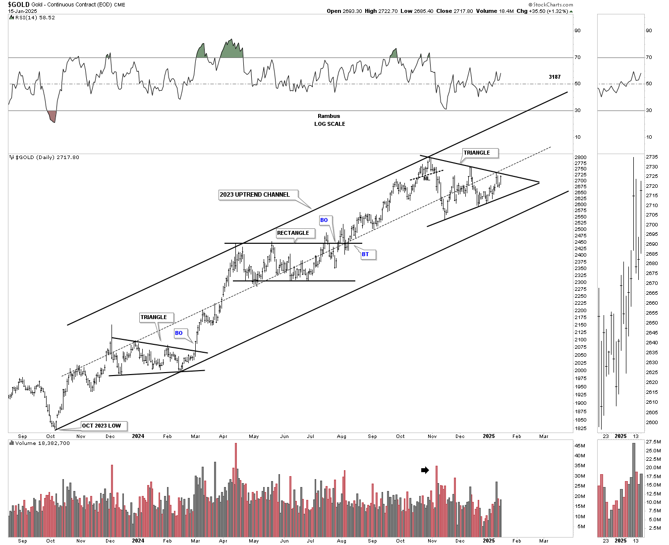
During the last strong bull run that ran from 2018 to the 2020 high you can see the small blue consolidation patterns that formed along the way which is classic bull market price action. After reaching its 2020 high all the energy had been used up and it was time for Gold to consolidate those gains forming the 2020 bullish flat top expanding triangle consolidation pattern.
That 2020 flat top expanding triangle has had enough energy to produce the current rally phase with the blue triangle forming the next consolidation pattern. This current setup should have enough energy to take Gold above 3000 once the triangle completes.
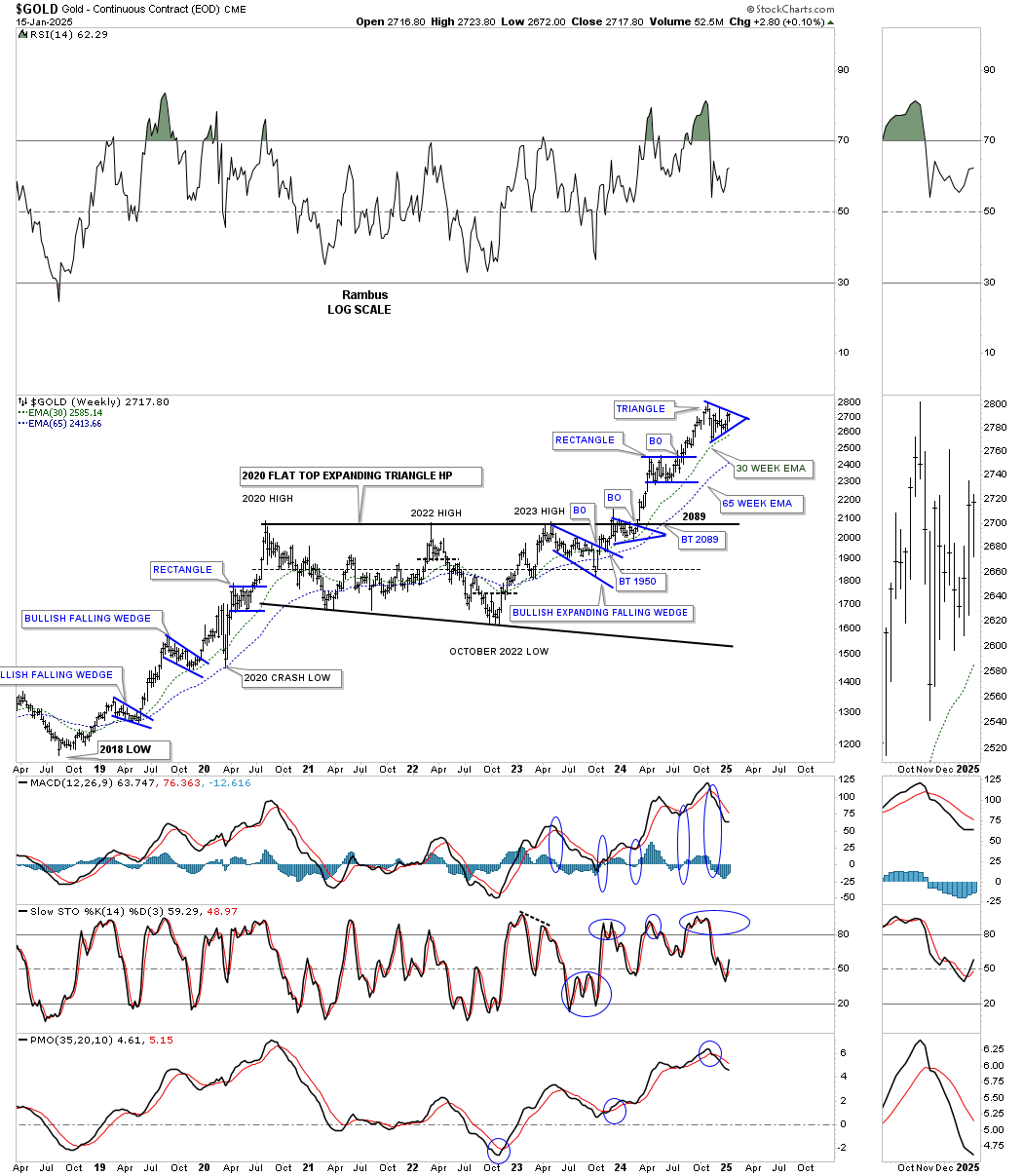
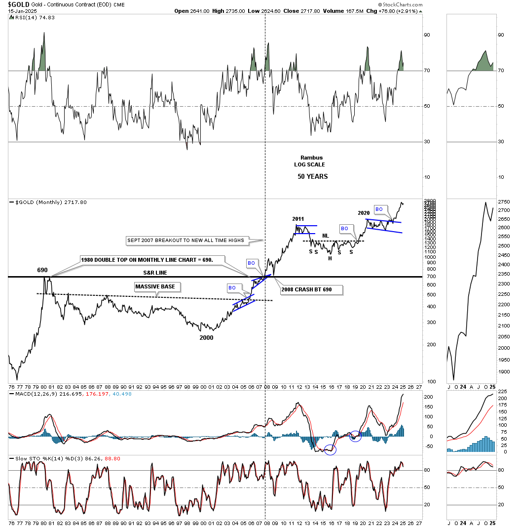
Just like the HUI which began its secular bull market in 2000 so did Gold. From the 2000 low to the 2011 high Gold actually shows a parabolic rally even on this log scale chart. The bear market low formed that massive H&S consolidation pattern which was big enough to launch this 2nd leg up in Gold’s secular bull market uptrend channel.
During the bull market years from 2000 to the 2011 high the 10 and 20 month ema did a beautiful job of holding support except for the 2008 crash low. Notice how nicely aligned the 10 and 20 month ema’s are right now.
This quarterly bar chart shows the big base that Gold built in the late 1990’s which launched the secular bull market to the 2011 high. I measured the 2000 base as shown by the black rectangle and moved it up to the 2016 H&S bear market low which shows both bases are almost exactly the same in time and price. My conclusion was that if the 2000 base was large enough to launch an 11 year bull market then the 2016 H&S base should be large enough to launch a similar bull market. Again big patterns lead to big moves.

Below is the quarterly line chart for Gold which shows its bull market from the 2000 low to the 2011 high and how smooth the price action was with the exception of the 2008 correction low.
Since the breakout from the 2016 H&S base note again how smooth the price action was until the beginning of the 2020 expanding triangle, keep in mind this is a quarterly line chart so the large patterns may look a bit different. Since the breakout from the expanding triangle, again note how smooth the price action has been except for the last quarter where you can see a small sideways move before moving higher starting in the first quarter of 2025.

Below is a long term monthly chart for Gold which goes all the way back to the 1976 low for perspective. After topping out in 1980, after that parabolic rise, it took 20 years to consolidate that massive bull run before Gold was ready to launch a new bull market in 2000.
Note the classic Chartology at the 1980 high, horizontal black line. The small blue bullish rising wedge formed just below the 1980 horizontal line before the breakout and then the backtest from above during the 2008 crash which doesn’t look like much now, but it was the biggest correction from 2000 to 2011 that Gold experienced.
Silver has been a little frustrating in that it has been taking its time in moving higher, but the Chartology still looks fine and nothing is broken. This daily chart shows the rally into the May 2024 high where the black bullish expanding falling wedge began to form as the next consolidation pattern.
Sometimes the breaking out and backtesting process can be very quick and other times it can be a long drawn out affair as Silver is showing right now. Note the last touch of the top rail of the bullish expanding falling wedge which formed a small double bottom. Last week Silver broke out above the double bottom trendline and backtested it on Tuesday and moved higher today completing the backtest. Now we just need to see Silver make a new higher high to start the new uptrend.
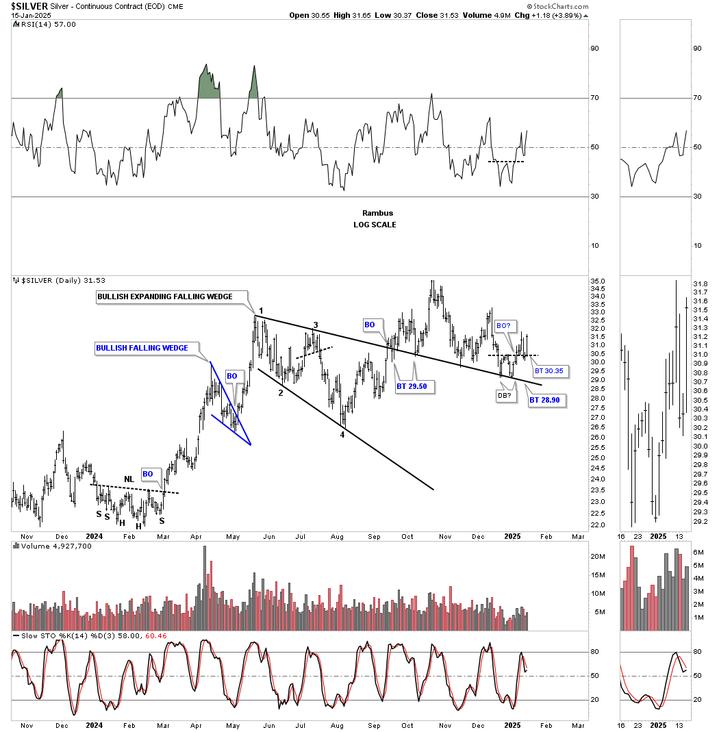
Moving on to this longer term daily chart Silver has formed a very symmetrical H&S consolation pattern, as shown by the Neckline symmetry line which shows the low for the left and right shoulders. After the initial breakout Silver backtested the neckline before moving higher where it formed the blue bullish expanding falling wedge that we just looked at on the shorter term daily chart above. This H&S consolidation pattern has a price objective up to the 40 area at a minimum.
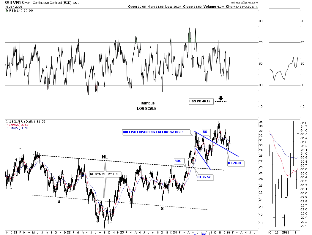
This weekly chart for Silver shows the same H&S consolidation pattern as the daily chart above, but with a horizontal neckline. It’s a horizontal neckline because I didn’t use the weekly reversal bar at the 2022 high.
This long term monthly chart shows Silver’s secular bull market uptrend channel with the last consolidation pattern being the 2020 bullish expanding falling wedge.
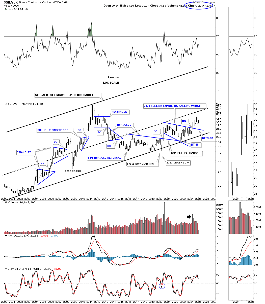
I would like to show you two more very large consolidation patterns that are strongly suggesting that the PM complex will have many years to go in its secular bull market that began in 2000.
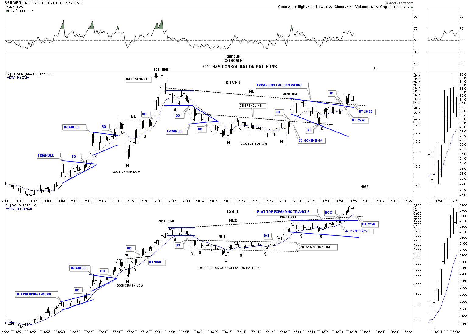
This next chart is a combo chart which has Silver on top with Gold below. I realize how hard it will be for many of you to grasp the significance of these 2011 H&S consolidation patterns, but we’ve been following these two H&S patterns since the right shoulder low.
As we know Gold has been much stronger than the rest of the PM complex as shown by the up sloping neckline vs Silver’s down sloping neckline. Gold has been trading in new all time high territory since breaking out from its neckline vs Silver which is only halfway to its all time high at 50.
What is interesting about these two very similar 2011 H&S patterns, with different sloping necklines, is that they both broke out above their respective necklines at about the same time which I find pretty amazing.
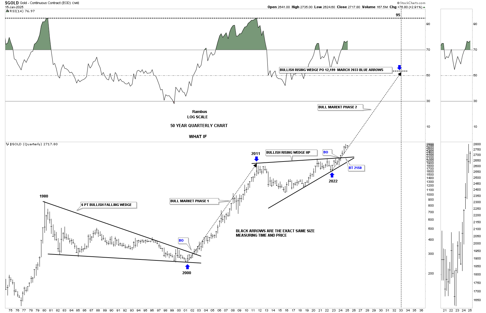
For years I’ve always heard precious metals analysts throw out big numbers for gold that seemed outrageous until I put together this 50 year quarterly chart for Gold. If we look at the correction that began at the 1980 high to the 2000 bear market low a 20 year bullish falling wedge formed which led to the secular bull market up to the 2011 high.
If you take the price action from the 2011 high to the last reversal point in the 2011 bullish rising wedge we get a price objective for Gold up to the 12,100 area as shown by the long black arrows. So far the current angle of the bull market, compared to the angle of the 2000 to 2011 bull market, has been identical as shown by the blue arrows.
I’ll let the fundamentalist figure out what is going to cause another multi year leg up in Gold and the precious metals stocks, but I’ll use what the Chartology is strongly suggesting to guide my decisions in the PM complex. All the best…Rambus
Related Reading:
- Rambus: Blockbuster Chartology – October, 2024
- Rambus: Blockbuster Chartology – July, 2024
- Rambus: Blockbuster Chartology – April, 2024
- Rambus: Blockbuster Chartology – January, 2024
- Rambus: Blockbuster Chartology – October, 2023
- Rambus: Blockbuster Chartology – August, 2023
- Rambus: Blockbuster Chartology – May, 2023
- Rambus: Blockbuster Chartology – January, 2023
- Rambus: Blockbuster Chartology – October, 2022
- Rambus: Blockbuster Chartology – July, 2022
- Rambus: Blockbuster Chartology – May, 2022
- Rambus: Blockbuster Chartology – February, 2022
- Rambus: Blockbuster Chartology – October, 2021
- Rambus: Blockbuster Chartology – July, 2021
- Rambus: Blockbuster Chartology – April, 2021
- Rambus: Blockbuster Chartology – January, 2021
- Rambus: Blockbuster Chartology – October, 2020
- Rambus: Blockbuster Chartology – July, 2020
- Rambus: Blockbuster Chartology – May, 2020
- Rambus: Blockbuster Chartology – January, 2020
- Rambus: Blockbuster Chartology – October, 2019
- Rambus: Blockbuster Chartology – July, 2019
- Rambus: Blockbuster Chartology – April, 2019
- Rambus: Blockbuster Chartology – January, 2019
- Rambus: Blockbuster Chartology – October, 2018
- Rambus: Blockbuster Chartology – July, 2018
- Rambus: Blockbuster Chartology – April, 2018
- 2017 Annual Wrap Up – Does Your Pension Fund Have A Deep State Drain? – January, 2018
- 1st Quarter Wrap Up 2018 Web Presentation
- Blockbuster Chartology with Rambus – October, 2017
- Blockbuster Chartology with Rambus – July, 2017
- Blockbuster Chartology with Rambus – May, 2017
- Blockbuster Chartology with Rambus – January, 2017
- Blockbuster Chartology with Rambus – October 20, 2016
- Blockbuster Chartology with Rambus – July 21, 2016
- Blockbuster Chartology with Rambus – April 21, 2016
- Rambus: Are We in a Deflationary Spiral? – January 28, 2016
- The Dollar, Gold & the S&P 500 with Rambus – October 15, 2015