By Daniel Indiviglio
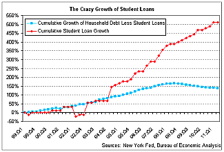
Here’s a chart based on New York Federal Reserve data for household debt. The red line shows the cumulative growth in student loans since 1999. The blue line shows the growth of all other household debt except for student loans over the same period.


